Project Vision
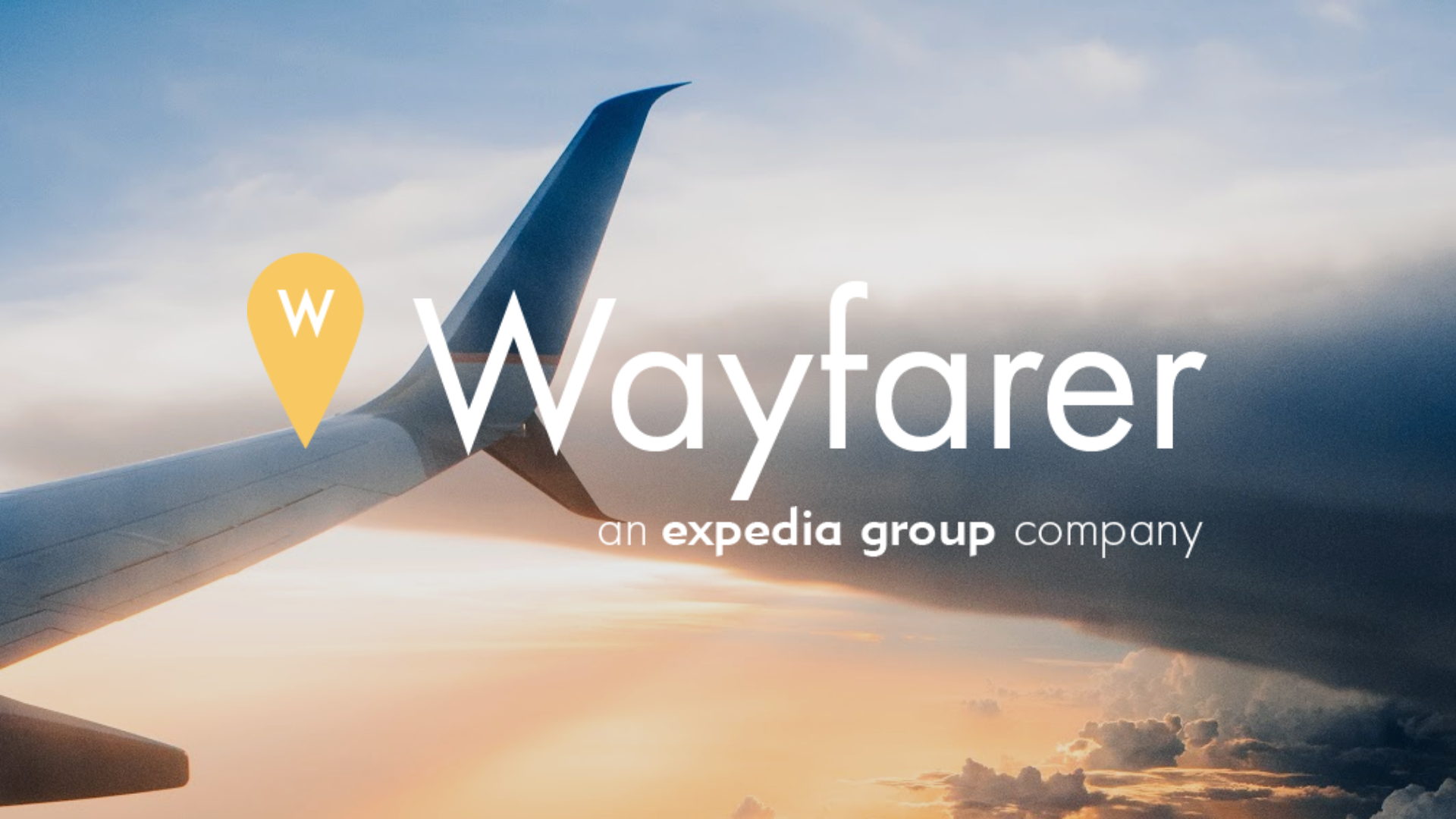
Wayfarer is a prototype for a mobile application developed for a three week design sprint for the IMD 351 course at UW Bothell. Operating under the idea that each team is a group of interns working with a new product division at the Expedia Group, the design challenge given is to create a mobile application for solo female travelers aged 45 and above.
OVERVIEW
Role
UX Designer Support | Wireframing | Low-fidelity
Duration
3 Weeks
Type
App Design | UX Design
Team
4 person design team
Challenge
Design a mobile application developed for a three week design sprint for the IMD 351 course at UW Bothell. Operating under the idea that each team is a group of interns working with a new product division at the Expedia Group, the design challenge given is to create a mobile application for solo female travelers aged 45 and above. The application must complement Expedia’s existing travel portfolio as well as contain a new feature unique to the market.
APPROACH: RESEARCH
Foundational
Each team member participated in reading traveler forums, articles, guides, and app reviews. Through this process each of our team members was able to draw conclusions regarding the topics they researched.
Market
A division of our team researched travel apps that are currently on the market, apps aimed at women who travel alone, apps for solo travelers, and apps designed for women who feel unsafe in their environment.
A division of our team researched which travel companies control the travel industry, pulling data from Allied Market Research, Market Watch, Statasia, and business insider, in order to draw conclusions regarding the online market, allowing for a competitive analysis of mobile applications as well as current trends in the market.
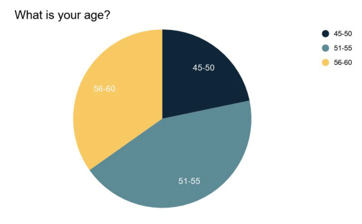
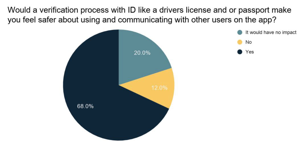
Target Audience
We were able to reach nearly 30 individuals from our target audience though our survey created in google forms. We chose to run a survey in order to gather information about our target audience. Our survey contained demographic questions, as well as polling about the usefulness of app features and settings that we had seen in our foundational and market research. Our survey also allowed us to take direct input regarding features we had not previously considered.
APPROACH: UX PERSONAS + SCENARIOS
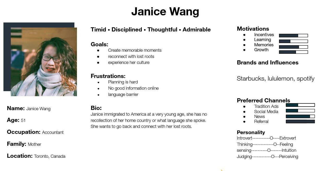
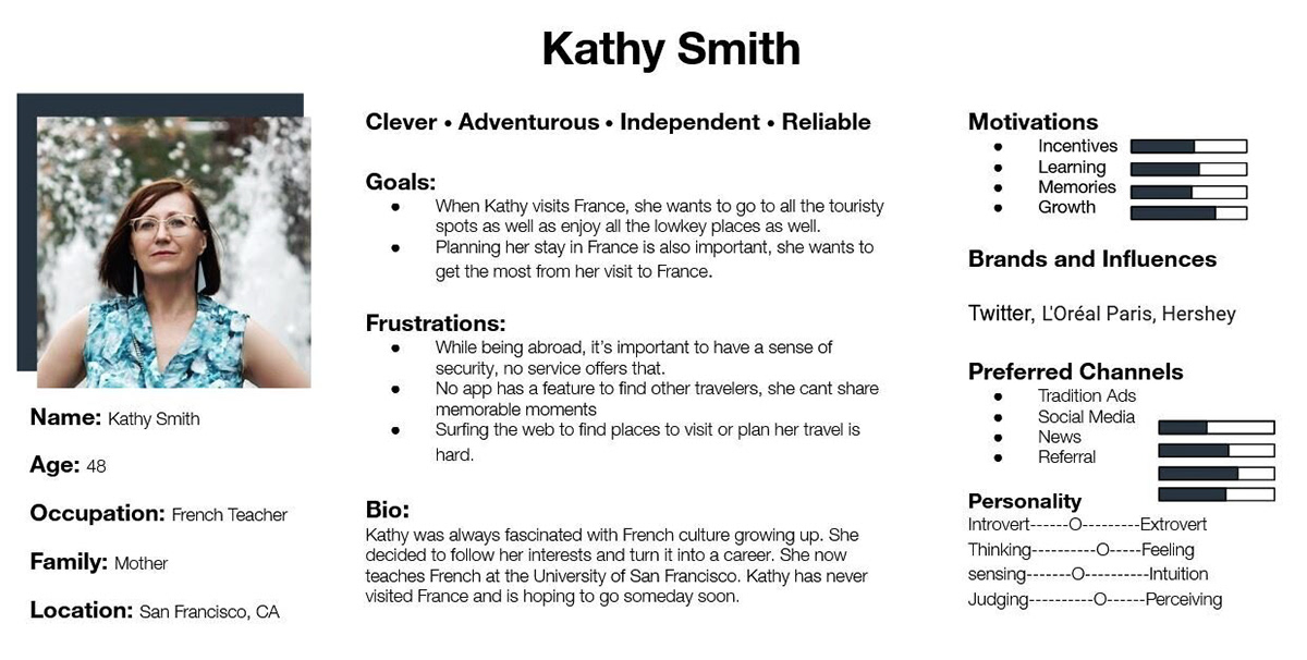
After completing our foundational research, our team created user personas. Kathy Smith, a 48 year old French teacher who is traveling to Paris, and Janice Wang, a 51 year old accountant who is planning to travel to China.
APPROACH: BRANDING
In order to develop a realistic sub-brand our team looked at the Expedia group, the owners of Expedia, Trivago, Hotels.com and multiple other major travel brands. We looked at how they visually defined themselves, focusing primarily on Expedia and the Expedia group. After looking at their style guides, brand identities, and how they visually identified themselves, our team looked to draw from this and create a logo brand identity that could fit into Expeida’s existing travel portfolio.
Logo

Choosing the pin to act as our brand mark, we knew it would be easily recognizable, while representing exploration and adventure. Drawing the logo colors from the Expedia colors was a way to maintain a level of connection between them.
Stylescape
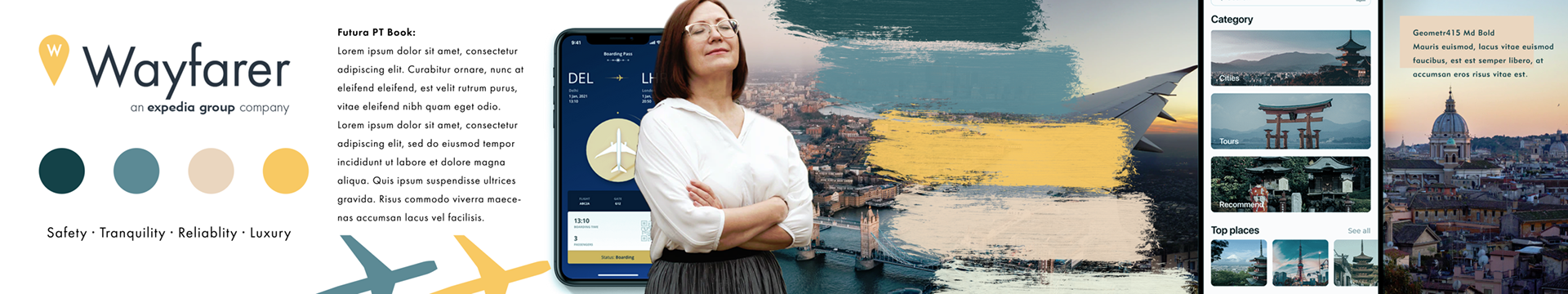
Instead of creating a traditional mood board, we created a stylescape. Looking to set the themes and tones for our brand, we wanted to draw from the Expedia colors, keeping the blue to represent the stable, calm and relaxing aspects of our brand while the yellows highlight the natural • bright • joyful tones of the Wayfarer Identity.
APPROACH: DESIGN MAP + WIREFRAME
Design Map
In order to visualize the informational architecture, our team created a map of the informational architecture of the Wayfarer App. This process helped us to visualize and build the general layout of the app, pages, and features before creating any of the wireframes.
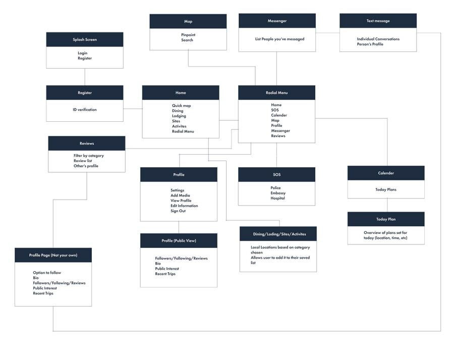
Wireframing
Our team created the wireframes in Figma, building off our our design map, and research, we constructed the screen structures, and content layouts. Taking into account our personas and UX scenarios, we designed our layouts by thinking through the immediate needs, and user journeys.

RESULTS
Our team was able to create high fidelity wireframes and mockups. This was many of our team members first time using Figma allowing for the opportunity to learn while designing. When creating the high fidelity wireframes we use the style guide as a strict baseline. We utilized the design styles system within Figma to use global styles where we were able to insert the brand colors, and type styles.
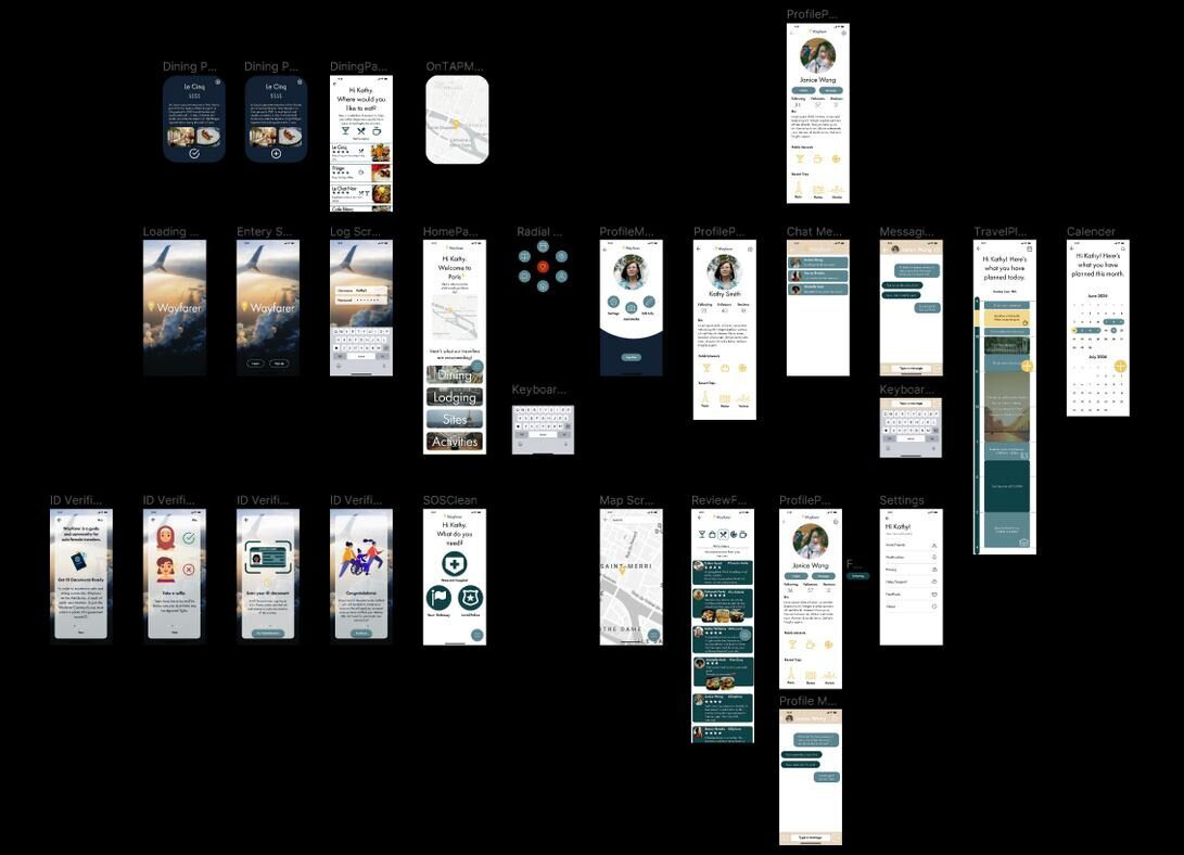
RESULTS: HIGH FIDELITY INTERACTIVE PROTOTYPE
The final stage of the project wa s to create a working prototype of our app within Figma to be used in our pitch to our professor and peers. Below is the Wayfarer App prototype within Figma.