PROJECT VISION
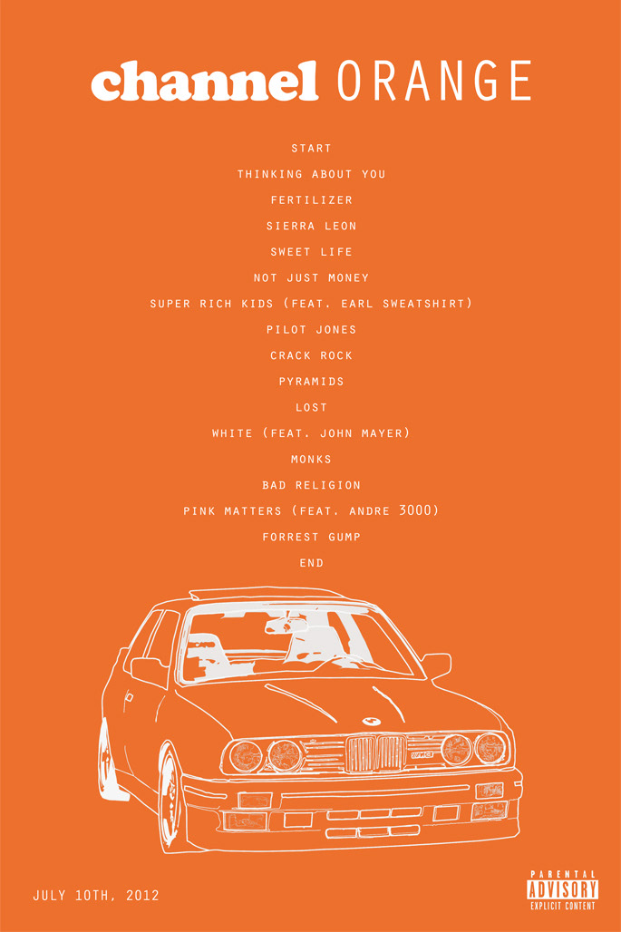
This is a recreation of Frank Ocean’s popular album, Channel Orange, in the form of a music poster. Channel Orange, by itself, is a very simple design with its iconic orange color and the text, Channel Orange. I primary used Adobe Photoshop for this project.
OVERVIEW
Role
Graphic Design
Duration
2 Weeks
Type
Poster Design
Team
1 person design team
CHALLENGE
To recreate Frank Ocean's first studio album, Channel Orange. Adding my own unique twist and creating a new personality for this album in a form of a poster. All while keeping the same theme and feeling of the original album cover.
INSPIRATION
I wanted to recreate this album because it’s one of the first albums that got me into listening to music deeply rather than just listening to the album at face value. It was an album that I’ve kept on replay and felt that there’s a song in this album for everybody. I don’t resonate with all of the album’s songs, but it’s vast range is something I can appreciate. Not every song on this album is an actual song, some are just voicemails or sounds of nostalgic memories. An example would be during the song “Start”; there’s a PlayStation 1 start up noise which can be referred to childhood memories. This album is more then just music but rather a feeling and why I wanted to make a poster out of it. I wanted to frame it in my room to show others that this is something to appreciate. The album cover may be simple but the music is far from that.
KEY ASPECTS
The BMW E30
The biggest thing on the poster is the car, a BMW E30. This car has become an iconic icon to Frank Ocean’s name as this car was used for his album cover on his first project, Nostalgia Ultra. The car’s orange paint matches the iconic orange on the album cover. The reason why I added the car to the poster is because Frank Ocean uses his songs to tell about his different experiences in life. Using cars as a time stamp to describe a certain period of his life, in this case, a BMW E30, was the car he had during this time. So with these details in mind, I felt that adding the BMW to the poster was a perfect fit, representing a period in his life with the car and the album being symbolic. The car was made to look like a simple sketch to fit the simpleness of the album cover.
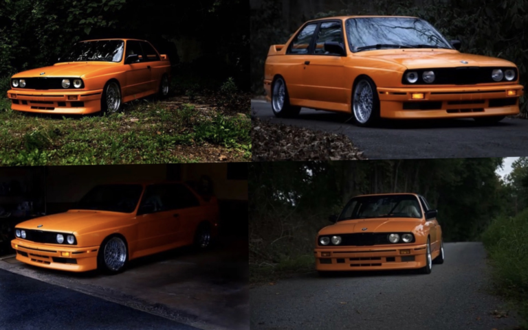
An Orange BMW E30, a car that has become iconic to Frank’s name
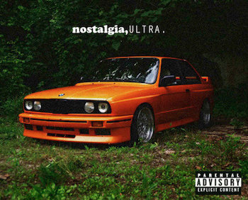
Frank Ocean first project, Nostalgia Ultra, released February 16, 2011
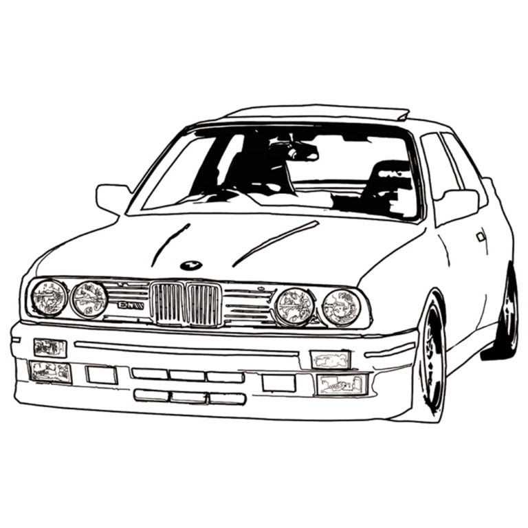
Sketch of Frank Ocean’s BMW E30 that was used in the poster
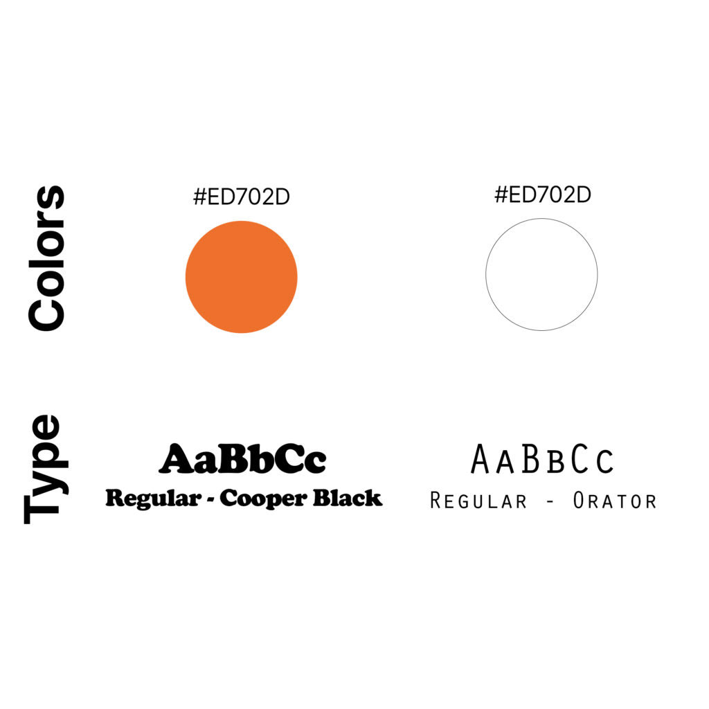
Text and Theme
I wanted to keep the simplicity of the album cover when creating this poster as I felt it fit the theme of the album very well. I chose to add the entire track list as if it was tour date locations. This causes the album cover to look like an music poster. The placement of the songs were set at the center as I personally felt that it balances out the poster. If I placed the track list left or right, it would leave lots of blank space and wouldn’t be as appealing. The font I chose for the track list and date at the bottom was Orator. The Orator font is the same font used in the “Orange” text in the original album cover. The other font used for “Channel” was Cooper Black. Using the same font would make the song names fit seamlessly, keeping that simple aesthetic of the album cover. I added the date the album came out and Parental Advisory on a whim and felt that it fit perfectly. Placing the text and Partial Advisory both left and right of the photo to further balance out the photo. I didn’t choose to make these aspects centered didn’t look appealing.
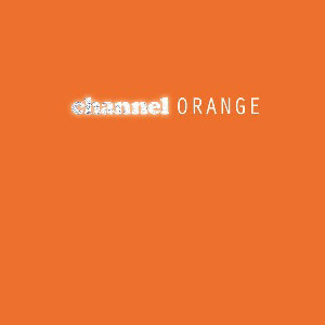
Original album cover of Channel Orange